

Usability.gov's guidelines
Discovered these web design and usability guidelines via a comment at 37Signals. I love the way each guideline is rated according to strength of evidence.Web Design - # - June 8, 2003 6:09:19 PM CEST
Acrobat, please anti-alias vector images!
 Who was the idiot at Adobe that turned off anti-aliasing by default in Acrobat. This puts designers in an impossible situation when they want to create a PDF that should look good on screen and good in print. If you use a vector image it will look like crap on the screen but if you use a raster image it will print like crap. Catch 22 until someone wakes up at Adobe.
Web Design - # - June 4, 2003 5:39:55 PM CEST
See your site as if you were Google
Very cool little app that allows you to see how your sites looks from Google's perspective Patience it takes a while to crawl. Get the whole story at EvoltWeb Design - # - March 13, 2003 6:35:40 PM CET
Content Management Tools Fail
Jupiter research has done another study that finds content management systems lacking. Duh, I could have could have told you this without the research. In my consulting work I am often asked to recommend a content management system. Here is what I tell them:- Big companies/Complex needs: custom build on a good framework with the knowledge that you will want to tear it down or transform it much sooner than you think. Make sure you spend time making it component based and the content reusable.
- Big companies/Standard needs: buy a cheap CMS and plan in its demise within three years.
- Smaller companies/Complex needs: get someone to build something in PHP or Zope.
- Smaller companies/Standard needs: get someone to deploy a cheap and simple CMS, This is where icogs will hopefully come to the rescue.
Web Design, Internet - # - March 5, 2003 1:22:54 PM CET
The Glass Wall
Just discovered that Matt Jones had put up the story of the BBCi redesign. I have yet to read the whole PDF but it looks mighty interesting. I am still not sure I really like the BBC home page. I have a feeling there is no scale in the information and therefore it is really difficult to separate all the boxes. The inside pages are much better. Having said that, one has to admit it must be one of the most difficult projects to take on.Web Design - # - January 18, 2003 7:35:17 PM CET
SelectORacle
Are you getting confused by CSS Selectors, why don't you translate them to English. (via Jim Roepcke)Web Design - # - January 17, 2003 6:16:53 PM CET
XHTML 2 or not to be
After Mark's frustration, Jefrey Zeldman adds to the XHTML2 debate. In my eyes his comments make a lot of sense.Web Design - # - January 15, 2003 6:59:12 PM CET
Face lift for the New Year
Finally updated the the design after procrastinating for half a year, Although this design still needs a lot more work it's not as drab as the old one. Apart from the obvious changes, I decided to finally switch to a serif font as browsers are getting better at handling anti-aliasing. I also tightened up the letter spacing in the headlines but will change a bunch of other things in the CSS as I go alongHappy New Year!
Web Design - # - January 2, 2003 5:08:44 PM CET
Is Jacob Nielsen getting soft?
This article on Flash Usability by Jacob marks a softening tone from him on Flash, could it be because Macromedia is a client or is it just because he realizes there are things that are more suited to Flash. Talking about flash this HTML vs. Flash usability test is very interesting.Web Design - # - November 29, 2002 5:18:09 PM CET
When good interfaces go crufty
Great article about how old design decisions stick around past their due date. I finally learned why the the windows contextual menu behaves in such a stupid way. The article also gave me an idea for an minor interface improvement in Mac OSX. I stopped using the open menu ages ago but still end up using the open recent sometimes. But what if the dock contextual menu could take care of that. In a way it would be much more logical. If open the contextual menu on a docked application that is not running I get the most recent documents and can then launch the application with the right document. If the application is already running I get open documents and recent documents. This means I don't need to know if the app is running and still get the functionality I want. (via StudioLog)Web Design - # - November 7, 2002 10:41:28 PM CET
Reasons ease of use doesn't happen on engineering projects
Another excellent article from UIWeb. I love the fact that he points out that compassion is a necessary skill. I would have used empathy but compassion is actually more powerful. (via Tomalak's)Web Design - # - November 6, 2002 12:10:25 PM CET
Web Application Usability
While researching Web Application Usability I bumped in to a couple of interesting resources I had not seen before:- Using Web widgets wisely Part 1 and Part 2 Some good general tips on using widgets
- Web Application Design Handbook: Sadly the site suffers from major usability problems so I can't link to it straight go here and in the left frame click web book. The book itself is packed with information.
- Usability Toolkit UI Test lab in a box, but the rest of the site also has a bunch of interesting stuff including a link to this resources on forms
Web Design - # - October 28, 2002 4:36:52 PM CET
Users Decide First; Move Second
Confirming what I long suspected users don't like DHTML menus.Web Design - # - October 21, 2002 10:40:11 AM CEST
Strategic usability: Partnering business, engineering and ease of use.
While updating my usability links I bumped in to this great UIWeb peice on how to move usability to a strategic level instead of a reactive tactical level.... By focusing on the lab, the methods, or the data, an organization or team can fall into the trap of externalizing ease of use. For change to take place, and better designed websites or products to occur, the attitudes and philosophies of usability and design must be internalized by everyone that makes decisions that effect the final design...
Web Design - # - October 21, 2002 10:27:59 AM CEST
Google User Experience.
Having been a great fan of the simple Google interface since it's inception. This goodexperience.com interview with Marissa Mayer from Google shows that a lot of thinking goes in to simplicity.All of us on the UI team think the value of Google is in not being cluttered, in offering a great user experience. I like to say that Google should be "what you want, when you want it." As opposed to "everything you could ever want, even when you don't."Lots of good stuff in the interview worth thinking about.
Web Design - # - October 15, 2002 6:23:10 PM CEST
The end of meta tags
For the wide web I think Andrew Goodman is essentially right in his declaration of the end of meta tags. With the advent of Google everything changed, but that still leaves the internal search engine of the organization. In this case I think meta tags can be very helpful in catching relevant pages. However, the question may be, is it worth the effort?Web Design - # - October 2, 2002 11:10:46 AM CEST
Wrap your brain around this!
 Just like Kottke and others I had to open Photoshop to believe this optical illusion. The funny thing is that I consider myself a professional regarding these kind of things, but, there was no way I could look at the full picture and convince myself that the two squares were the same color.
Web Design - # - September 28, 2002 6:12:56 PM CEST
Taming List with CSS
Most days, Cascading Style Sheets drives me nuts, even though most of the time it's not the fault of CSS but rather the browser's different ways of interpreting them. But today I am on a CSS high after reading this fabulously deep article on lists and CSS. I can't wait to get my hands on a potential application.Web Design - # - September 28, 2002 3:16:50 PM CEST
User-Centered URL Design
Right on! Great new word for my vocabulary: CMSJunkWeb Design - # - September 27, 2002 9:17:14 PM CEST
Internal and Outbound links
There seems to be a discussion going on among several blogs on the use of link differentiation for internal links and external links. A long time ago in the days of HTML2 or 3 I wrote something about the grammar of links (*) where I talked about the need to differentiate links. Of course in those days we still did not have CSS so the techniques I talked about are now irrelevant.
The current discussion centers automating this with various tools. Although differentiating internal and external links can have a real importance in some commercial sites I don't think it makes that much sense in the blog space. There it's much more important to differentiate key links versas support links. Slashdot is a good example of the problem. Their entries are so rich in links that the key link is often lost among support links. whereas if they had just put the most important link(s) in bold the problem would disappear.
Also there may be a very simple css solution on the way. All external links start with http:// so you could put a css selector on the href attribute and let css change the look. As for putting images they would need to be much more discreet then in Mark's example, I would much rather see a cursor change to something evocative, just need to think about what.
* I was amazed to see that one of my really old sites was still on the server almost unscathed. Funny to see a site a site that still tries to take into account old Classic Macs with their 512 pixel screen
Web Design - # - August 23, 2002 7:16:46 PM CEST
CSS and Font Sizing
Jacob Nilsen our favorite usability extremist has a new article up on Font Sizes where he laments the use of pixel sizing in style sheets. One the one hand I agree with Jacob Nilsen on this one, but, he fails to see the reasons the problem has blown out of proportion.- Browsers still can't handle CSS font sizes reliably. I have had plenty of bad surprises when I have tried to use point or em sizing. don't even talk about percentages. Even if you did set font sizes in points your system would have to know what your dot pitch is to make points relevant. I have seen factory installed machines with the wrong values and even some where the screen resolution is set differently to the LCD resolution making the whole screen fuzzy. So forget that the user will ever set his dot pitch.
- Screen dot pitch has increased dramatically. It used to be that most screens had 72 to 90 pixels per inch but with the arms race, especially among laptops, this has now gone up to around 110 on most laptops. This means a designer needs to take into account a 30% variance of size. That's not easy.
- Predictability, for most people this may not matter a lot but it's the bread and butter of a designer. If a designer sets the proportion of two items there is a usually a good reason for it. So let's suppose you have a menu in a site where the text was set to 12 pixels so it would fit in its allotted space. And the user overrides the font size (maybe 150% because he just came from a sadistic designer that likes 9 pixel fonts) suddenly your menu is 18px and breaks line-breaks in the worst places.
Design as with flexibility in mind, set as much text as possible in proportional fonts but where you absolutely need predictability use pixels as large as your esthetics can tolerate.
Web Design - # - August 21, 2002 7:25:18 PM CEST
More on the page paradigm
I was thinking back to the Mark Hurst's page paradigm article I mentioned a couple days ago. Basically the article says that you should not concentrate too much on figuring out a clever information structure for the site but instead concentrate on fulfilling the users needs from the perspective of each page. I could not agree more with his basic premiss. People don't have time to build a mental model of a site, they just need answers, that is unless the site is an intranet or something they use very often.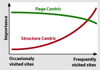 Anyway, this graphical model of the relative importance popped up in my head. Notice that the page centric model never tapers off to the same degree as the structure centric one. Also, you can assume a visitors arrive with a mental model for both how the page is structured and how the site is structured. So information architects that works on a site that is not frequently visited (the vast majority of public sites) should concentrate on the page paradigm and structure the site according to most common practice.
Web Design - # - August 20, 2002 8:57:04 PM CEST
Contingency design = Smart mistakes
Today I found this article about Making Mistakes Well on New Architect. As I started reading it felt very familiar, sure enough it was writen by one of the great guys from 37 signals where I had previously seen their great anthology of contingency design and white paper. But the great pearl was discovering their spoof site enormicon, a spoof on the world of new media companies.Web Design - # - August 19, 2002 6:46:01 PM CEST
Small Business Blogging
Dan Brinklin put the blog in its right perspective:A reverse-chronological list of postings, with a managed archive, is a general function that can be used for many things.He goes on to give a lot of good examples where blogs can be used for small businesses. We have used blogs in many situations. I once advised a company to use it for a very time-dependent crisis communication campaign. You could even argue that every site that has a news section also has a blog that acts as its latest stories index. We also over used them in our intranet. There the problem is that since it's so much easier to jot down ideas in a blog than in a more structured location, good ideas have a tendency to disappear into the timeline archive. In any case, whether you look at Blogs as tools or the publishing phenomenon, they both have an important role.
Web Design - # - August 15, 2002 4:45:19 PM CEST
Web Standards for Hard Times
Wow, I thought WebMonkey was dead, but today I saw one article popped up in the blogdex top 25. Sure enough they are still active with an article about Web Standards just published yesterday. Once upon a time, Webmonkey was my primary source for learning new web techniques. Then they got bought by Lycos and the quality went down. When Terra bought Lycos I thought it was going to be the last nail in the coffin for a site that was once great.Web Design - # - August 9, 2002 7:48:10 PM CEST
Links everywhere in XHTML 2
W3C released a working draft of XHTML 2. K5 has a good overview of the changes. In my opinion the possibility to add a link to any element is very interesting. I can think of a lot of cases where I have wanted to add links to table cells, but It could also be interesting to see it could be used to add semantics to links. Hmm needs more looking into.Also note worthy is the addition of the nl Navigation List element. Ironically it the first time the HTML standard recognizes that there are navigation elements on a web page. From looking what I can gather, it will behave in a similar way to drop-down menus. I'm not a big fan of drop down menus whether DHTML or the standard form element. I hope we will be able to define different behaviors using CSS.
Web Design - # - August 8, 2002 5:20:34 PM CEST
Adventures in Low Fidelity: Designing Search for Egreetings
Very interesting story about the design and user testing of an improved search for egreetings.I have never considered doing user test based on paper mockups of a site. I have a feeling the experience would be far too different from the act of sitting in front of a computer
Anyway it's always good to be reminded that the information architect is not always right and in the end we all just serve the user.Web Design - # - August 5, 2002 7:33:38 PM CEST
The Page Paradigm
Mark Hurst has written what I think is a very important usability piece called The Page Paradigm. Consider this:The page paradigm states that on any given Web page, users have a particular goal in mind, and this goal drives their use. Either they click on a link that they think will take them toward the goal, or (seeing no appropriate forward clicks) they click the Back button to take another path.The key word here is "on any given web page".I have seen projects that have failed because people have been wasting way to much energy figuring out good information structures but failed to live up to the user needs from the page perspective. Please read it, it's worth every byte!
Web Design - # - August 1, 2002 7:06:09 PM CEST
Dive into Accessibility
Dive into Mark has published a great guide on accessibility I love the way he has each time added who benefits from each technique. The only qualm I have is that he does not emphasize enough the general benefits. For example In the meaningful titles page I would like to add that for people like me that constantly surf by popping up new windows or tabs it can be a huge benefit to have good titles.Web Design - # - July 27, 2002 9:39:53 PM CEST