EXCERCISING DYSLEXIA
Usability comparison between Mac OS X and Win NT
Greg pointed out this usability comparison between Mac OS X and Win NT. It's a nice reminder of why I love Mac so much. Many people will think it's unfair since it's written from a mac users perspective. But then if you read the arguments he raises there are some important points on both sides of the argument.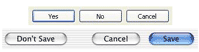 The dialog boxes part is a striking example.
To the mix, I would like to add my pet annoyance with windows XP.
When I use menus I usually use the click-drag-release method. Once upon a time this was not even possible on windows you had to click to make the menu appear and then click again on the menu item you wanted. Later that got corrected and you could use the click-drag to the menu item you wanted. But somehow sadly you can still not do this with a contextual menu. There you have to right click release and then click the item, whereas on the Mac this can all be done in one movement, right-click-drag-release.
![]() Another Windows annoyance that has sadly started to spread to a lot of mac applications is the overuse of toolbars. The problem is not so much the tool bar concept itself but the result it has on users. When the Mac first came to the market all interfaces were keyboard based and a lot of pundits derided it, they said that the keyboard was a much faster way of entering commands. The thing is, they all missed an important point. The mouse was not a replacement of keyboard commands but an addition that allowed you to do new things that were very difficult to do with a keyboard.
Another Windows annoyance that has sadly started to spread to a lot of mac applications is the overuse of toolbars. The problem is not so much the tool bar concept itself but the result it has on users. When the Mac first came to the market all interfaces were keyboard based and a lot of pundits derided it, they said that the keyboard was a much faster way of entering commands. The thing is, they all missed an important point. The mouse was not a replacement of keyboard commands but an addition that allowed you to do new things that were very difficult to do with a keyboard.
So what has this to do with toolbars, well, on the Mac, or on Windows, every time you access a menu you are reminded of the keyboard shortcut. After a surprisingly short time you start getting annoyed of all the time accessing the menu so you switch to using the keyboard shortcut. But with tool bars this is a different story. The main culprit is that there is no way of learning the keyboard shortcut by simply using using the tool bar. The second problem is that their tooltips don't even contain the keyboard shortcut. So if you use the toolbar and you get annoyed at constantly needing to access it, the only way to find the keyboard short cut is to look it up in the menu. but since you don't even use the menu any more you first have to find it. The net result is that there is a whole generation of computer users that are not learning keyboard shortcuts. You don't believe me, look over the shoulder of a newly graduated secretary and you will see that they mouse for almost every command.
As I said before I don't have anything deeply against the concept of toolbars I would just like to see them designed in a smarter way that encourages learning and saves space. Photoshop7 has a great one that is context sensitive to the tool you are using displaying only what is relevant for that tool.
Alpha Party
 Yesterday we had a icogs get together to celebrate the alpha version. I want to thank everyone who took the time to come and hope they now have a better idea of what icogs is about.
Internal and Outbound links
There seems to be a discussion going on among several blogs on the use of link differentiation for internal links and external links. A long time ago in the days of HTML2 or 3 I wrote something about the grammar of links (*) where I talked about the need to differentiate links. Of course in those days we still did not have CSS so the techniques I talked about are now irrelevant.
The current discussion centers automating this with various tools. Although differentiating internal and external links can have a real importance in some commercial sites I don't think it makes that much sense in the blog space. There it's much more important to differentiate key links versas support links. Slashdot is a good example of the problem. Their entries are so rich in links that the key link is often lost among support links. whereas if they had just put the most important link(s) in bold the problem would disappear.
Also there may be a very simple css solution on the way. All external links start with http:// so you could put a css selector on the href attribute and let css change the look. As for putting images they would need to be much more discreet then in Mark's example, I would much rather see a cursor change to something evocative, just need to think about what.
* I was amazed to see that one of my really old sites was still on the server almost unscathed. Funny to see a site a site that still tries to take into account old Classic Macs with their 512 pixel screen
filed in: Web Design - 23 Aug 2002 21:16 - #
CSS and Font Sizing
Jacob Nilsen our favorite usability extremist has a new article up on Font Sizes where he laments the use of pixel sizing in style sheets. One the one hand I agree with Jacob Nilsen on this one, but, he fails to see the reasons the problem has blown out of proportion.- Browsers still can't handle CSS font sizes reliably. I have had plenty of bad surprises when I have tried to use point or em sizing. don't even talk about percentages. Even if you did set font sizes in points your system would have to know what your dot pitch is to make points relevant. I have seen factory installed machines with the wrong values and even some where the screen resolution is set differently to the LCD resolution making the whole screen fuzzy. So forget that the user will ever set his dot pitch.
- Screen dot pitch has increased dramatically. It used to be that most screens had 72 to 90 pixels per inch but with the arms race, especially among laptops, this has now gone up to around 110 on most laptops. This means a designer needs to take into account a 30% variance of size. That's not easy.
- Predictability, for most people this may not matter a lot but it's the bread and butter of a designer. If a designer sets the proportion of two items there is a usually a good reason for it. So let's suppose you have a menu in a site where the text was set to 12 pixels so it would fit in its allotted space. And the user overrides the font size (maybe 150% because he just came from a sadistic designer that likes 9 pixel fonts) suddenly your menu is 18px and breaks line-breaks in the worst places.
Design as with flexibility in mind, set as much text as possible in proportional fonts but where you absolutely need predictability use pixels as large as your esthetics can tolerate.
filed in: Web Design - 21 Aug 2002 21:25 - #
More on the page paradigm
I was thinking back to the Mark Hurst's page paradigm article I mentioned a couple days ago. Basically the article says that you should not concentrate too much on figuring out a clever information structure for the site but instead concentrate on fulfilling the users needs from the perspective of each page. I could not agree more with his basic premiss. People don't have time to build a mental model of a site, they just need answers, that is unless the site is an intranet or something they use very often.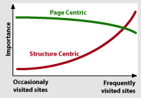 Anyway, this graphical model of the relative importance popped up in my head. Notice that the page centric model never tapers off to the same degree as the structure centric one. Also, you can assume a visitors arrive with a mental model for both how the page is structured and how the site is structured. So information architects that works on a site that is not frequently visited (the vast majority of public sites) should concentrate on the page paradigm and structure the site according to most common practice.
filed in: Web Design - 20 Aug 2002 22:57 - #
Netcenari
 Sacha, a webdesigner friend of mine just went public with his icogs powered site, the first one not directly connected to the project. The cool thing is that it represents the typical application we hope to see. He had just finished a draft version of the site when he sent it to me for comment. We added a couple of sitems and the cog code and bingo his news is now driven by icogs.
Contingency design = Smart mistakes
Today I found this article about Making Mistakes Well on New Architect. As I started reading it felt very familiar, sure enough it was writen by one of the great guys from 37 signals where I had previously seen their great anthology of contingency design and white paper. But the great pearl was discovering their spoof site enormicon, a spoof on the world of new media companies.filed in: Web Design - 19 Aug 2002 20:46 - #
Writing for the living web
I better take these tips to heart. Luckily the last one shows that there still might be hope for me10. Relax!I would also add a tip number 11: Position your writing. Even though I don't practice what I preach, I think it would be much more effective if I chose a couple of related topics and concentrated on those. The problem is that I am interested and opinionated on way too many issues. And it would be boring to always write about the same thing.
Don’t worry too much about correctness: Find a voice and use it. Most readers will overlook, and nearly all will forgive, errors in punctuation and spelling.
Small Business Blogging
Dan Brinklin put the blog in its right perspective:A reverse-chronological list of postings, with a managed archive, is a general function that can be used for many things.He goes on to give a lot of good examples where blogs can be used for small businesses. We have used blogs in many situations. I once advised a company to use it for a very time-dependent crisis communication campaign. You could even argue that every site that has a news section also has a blog that acts as its latest stories index. We also over used them in our intranet. There the problem is that since it's so much easier to jot down ideas in a blog than in a more structured location, good ideas have a tendency to disappear into the timeline archive. In any case, whether you look at Blogs as tools or the publishing phenomenon, they both have an important role.
filed in: Web Design - 15 Aug 2002 18:45 - #
The problem with current copyright law.
Please listen to this Lawrence Lessig talk about the problems with current copyright law. This talk really drives home the reason why the perpetual copyright extensions and other related laws are damaging our culture.Update: Also read this interview with Lawrence Lessig on Patents and the Internet.
Security is about people.
Lot of good bits in this article about security from the perspective of Bruce Schneier, author of Applied Cryptography.The federal government and the airlines are spending millions of dollars, Schneier points out, on systems that screen every passenger to keep knives and weapons out of planes. But what matters most is keeping dangerous passengers out of airline cockpits, which can be accomplished by reinforcing the door.There is lots more there about the inconsistencies of the homeland security measures, but also more about traditional network security.
How to instantly change your surfing habits
A couple of weeks ago I discovered the fantastic NetNewsWire. It's an amazing little RSS reader with a great user interface. I noticed how much influence it's having on my surfing habits because now my custom startup page has much fewer links marked as visited. As with many of these sites I now use NetNewsWire to scan their RSS instead of monitoring them manually. It says something about the importance of RSS. I just wish 10am would wake up from coma as he had a great keyword aggregation mechanism. OK, I better start working on my own RSS.Web Standards for Hard Times
Wow, I thought WebMonkey was dead, but today I saw one article popped up in the blogdex top 25. Sure enough they are still active with an article about Web Standards just published yesterday. Once upon a time, Webmonkey was my primary source for learning new web techniques. Then they got bought by Lycos and the quality went down. When Terra bought Lycos I thought it was going to be the last nail in the coffin for a site that was once great.filed in: Web Design - 09 Aug 2002 21:48 - #
Links everywhere in XHTML 2
W3C released a working draft of XHTML 2. K5 has a good overview of the changes. In my opinion the possibility to add a link to any element is very interesting. I can think of a lot of cases where I have wanted to add links to table cells, but It could also be interesting to see it could be used to add semantics to links. Hmm needs more looking into.Also note worthy is the addition of the nl Navigation List element. Ironically it the first time the HTML standard recognizes that there are navigation elements on a web page. From looking what I can gather, it will behave in a similar way to drop-down menus. I'm not a big fan of drop down menus whether DHTML or the standard form element. I hope we will be able to define different behaviors using CSS.
filed in: Web Design - 08 Aug 2002 19:20 - #
Cheesy WTC Proposals
Xavier called these alternative plans for the new WTC cheesy. He is right but at least some of them have a little more panache than the official ones. When I look at the official ones I can't help but feel I a bland resignation when there is such an opportunity for a more positive forward looking statement. I quite like this one even if it could be blamed for being a little backwards looking. It sort of restores the New York skyline without forcing anyone to work at the 150th floor, which I understood was a big consideration when they started working on the new plans.
Adventures in Low Fidelity: Designing Search for Egreetings
Very interesting story about the design and user testing of an improved search for egreetings.I have never considered doing user test based on paper mockups of a site. I have a feeling the experience would be far too different from the act of sitting in front of a computer
Anyway it's always good to be reminded that the information architect is not always right and in the end we all just serve the user.filed in: Web Design - 05 Aug 2002 21:33 - #
Very cool!
The archives work and so do the categories. Just figured out that I can do some really cool stuff with the categories. In the category template I added a bit of Cog code to the banner image that now feeds a custom banner for each category: <img src="" cog:attribute="src = text:/img/${#url}_banner.gif" ... > this allows me to point to a custom image for each category. Here you can see the results: Still have lots of ideas for improvements using the categories but still need to check if they are possible... Vincent HELP!The Page Paradigm
Mark Hurst has written what I think is a very important usability piece called The Page Paradigm. Consider this:The page paradigm states that on any given Web page, users have a particular goal in mind, and this goal drives their use. Either they click on a link that they think will take them toward the goal, or (seeing no appropriate forward clicks) they click the Back button to take another path.The key word here is "on any given web page".I have seen projects that have failed because people have been wasting way to much energy figuring out good information structures but failed to live up to the user needs from the page perspective. Please read it, it's worth every byte!
filed in: Web Design - 01 Aug 2002 21:06 - #
News is spreading fast!
Oups... It seems we have a lot of expectations to live up to. Over at Defrang.com we can readthe upcoming icogs service powered by a killer templating engine. You'd better stay tuned...and over at Yabon we read:
which announce the very next revolution in the blog world (and a lot more actually)Well I guess I better get back to work on living up to expectations. Besides I also need to get the categories and archives working here.