

iTunes Music Store
I admit I have become a Music Store addict. Up to now my addiction has been tempered by the limited selection and high album price but after reading this:Apple strongly recommends going even lower than $9.99 [Recommended Album Price]. They'd like to see that price drop to make the full-album purchase even more desirable.and other notes from the Music Store Indie Event I think I am in trouble.
Apple as cultural innovators
Tim has cool comments on Apple as an innovator"...But what Apple does so well is to realize the potential in a technology, and to frame it in such a way that people discover that they need it. In a way, they are cultural innovators more than they are tech innovators... "
Living without Word
Yesterday I had a discussion with a friend about the fact that I must be nuts not to have MS Word installed on my computer. I am probably among the 0.01% of professionals that don't have Word on his computer, I don't even have a substitute like open office. The reason I don't have Word is not because it is a Microsoft product but rather because it's useless to my needs.I very rarely need to produce paper documents. Most of my reports to clients are published straight to web where they can live a more useful and dynamic life than a paper document. Almost all my correspondence is email. That leaves just a couple of paper documents a month and for those I use indesign an application that produces beautiful document and leaves me in control.
So the only down side of not having word is that people tend to send me word files. Most of those I can safely crap and the few that come from clients I can have converted by friends or colleagues.
iGesture
This looks quite cool. However, I wonder if the commands are not a little too complicated, too many fingers involved. (via unsanity)Improving the Safari user interface.
Dave Hyatt has called on Safari user to to give suggestions on user interface improvements. Here is my take on an already very good browser:
Tabs: I guess this is the most requested UI feature. Although I love the tabs in Chimera I think we need to find a smarter implementation. Ironically the main issue I have with tabs is that I love them so much that they fill up too quickly. So when surfing with Chimera I tend to have multiple windows open full of tabs and then finding a particular page tab put's me in a worse situation as I can not use a window menu. Instead, I have to scan the tabs of each open window. Having said that if implemented as tabs, use the favorites bar and make the bookmarks a permanent tab:

Just push the standard favorites to right as you open more tabs. Another, probably better possibility is drawers.
The brushed metal look: Here I will differ from the general Mac community in saying that the main reason apple tends to use brushed metal over standard Aqua for so many of their applications is that Aqua is not that good. It tends to be too high key. Here is an example of a web page viewed with both interfaces:
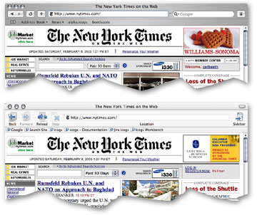
Notice how in the chimera screen shot the web page blends in with the UI. This is not a good thing and affects many Aqua applications. The Standard Aqua theme is about 5% and does generate enough contrast between the document and the user interface. Now brushed metal on the hand goes from around 40% to 20% and tends to contrast too much, the light to dark fading can also be confusing. what Apple needs here is a new theme that is somewhere in between these two. Something between 15% and 20% would be good. Irony is that OS9 averaged about 20%. With Apple wanting to clearly differentiate OSX from 9, the likelihood that Apple will listen is probably zero. One interesting side note is that the choice of brushed metal has allowed them to reduce the vertical space that the UI takes up, a good thing!
Shortcuts a la Chimera and OmniWeb is a must and simple improvement. Plus then possibility to hide the Google search box.
A wysiwyg activeX like component: This is desperately needed in OSX Browsers. Hopefully it would be part of WebCore and better than the one offered in windows. The most important thing is that it has to be real easy for web developers to implement without requiring browser sniffing. Jim Ray has other good ideas for WebCore
There is also plenty of attention to detail I like:
- The shaded link box when you drag and drop a URL. Should maybe be extended to the address bar and bookmarks. (Consider even adding it to cocoa framework for other programs to exploit)
- The way bookmarks are organized and presented. And the possibility to have the bookmarks as the default view when opening a new window.
- The lack of fluff. I don't want to see Safari merged with NetNewsWire, Sherlock and co. Keep the browser simple and concentrate on cross application integration. For example allow some kind of way for the user to transfer a RSS link to NetNewsWire or another RSS reader.
Starting to love Safari
I am amazed how quickly Safari has taken over my mind share. When I first looked at it I dismissed it because it did not have tabs and less than perfect CSS Support. I had grown addicted to that those features in Chimera. But now I am realizing I am spending more and more time in Safari by choice. Today I was in for another positive surprise. One of the things I love in safari is the full page bookmarks management, a kind of virtual tab (hopefully the basis to bring in completely). As I was there adding a new folder to the bookmarks I realized it would be great if the browser started up on the bookmarks page. As was just about to file bug report with the idea when I realized maybe they already had. Sure enough in the preferences there it was. This is what I love in Mac software, usually if you think something should work in a certain way, it does.Some thoughts on the Jobs keynote
I guess three days should be enough to dissipate the reality distortion fields from the MacWorld Keynote. So here is my assessments of the stuff:- Final Cut Express Brilliant move, anyone that has played around with iMovie will want to get their teeth into something a little more powerful but at $1000 final cut is beyond the scope for most people $300 is much more acceptable.
- iPhoto2, iMovie3 and iDVD3 all look like good upgrades and the iLife integration is also a smart move.
- Safari Like almost everyone I surprised apple did not pick the Gecko but after some reading on the web I think this letter to the KDE team and this old post from Dave Hyatt one of the Safari team members and one of the people behind my current favorite browser Chimera reveals the general thinking. Anyway it seems the renderer still has a long way to go and as long as they don't get rid of the Metal look and add tabs I will stick to Chimera.
- Keynote Maybe the most significant announcement of the MacWorld. Keynote could be a the first step in Apple's declaration of independence from Microsoft. Take the horrible PowerPoint and make something that both pro's and beginners can love. By fully leveraging Quartz it looks like they have just done it.
- The 17" PowerBooks What can I say, This is the machine I have dreamed of for years. Now that it is available why am i not going nuts. It's a little bit too expensive and the screen resolution could be higher, everything else is perfect.
- The 12" PowerBooks Also a gorgeous machine but again in my opinion a little flaw in not including DVI video output. This machine combined with one of Apple's beautiful desktop LCD's would have made make a killing.
Is the desktop interface dead?
Steve Johnson asks the question. while comparing MS and Apple strategies.The great OSX finder debate
I can relate to a lot of the points in the OSX finder debate, I also agree that the finder still needs a lot of work before it reaches OS9 usability levels.this comment by Jonathan Crowe sums up the reason why the switchers can not understand all the fuss from old OS9 users.
...I have no problems with the OS X Finder ? and, to be quite honest, I don?t use it that much. I don?t push files around that often, and when I do, I tend to use the file for quite some time, or access the file from within the application...The problem here is that for most OS9 users the finder was not a file manager but rather the interface to their documents. For example I never use the open dialog in an application but rather find it a lot faster to switch to the finders spacial navigation and there either double click or drag and drop the document I want to open. In my opinion the open dialog is just interface cruft.
The problem with OSX is that three very important elements that made this very efficient in OS9 are no longer there in OSX.
- File Type Metadata This makes it clear what application can open what document.
- Spacial memory in the finder. One of the reasons it is much more efficient to switch to the finder when you open a document is because you know where you put in spacial sense of the word.
- Tabbed Windows What can I say, I loved them, my dock is even to the right aligned in the hope that they will one day come back.
Apple switch in a Catch 22
Some conservative in the US is running a copy cat switch campaign. The problem is how should apple react to this. I think it is very difficult to claim copyright infringement (dubious) without seeming to take political sides. and if they don't react some other will think they are endorsing the candidate. Catch 22. via CamA Jaguar tip a day keeps...
Ken Bereskin has a very cool weblog where he highlights a new feature of Jaguar each day Here is the first one if like me you want to explore the whole list.Is developing for the mac crazy?
Joel triggered a big debate with his article that basically claimed you had to be a nut to develop for the mac market. Brent Simmons responded that it was a question of emotional appeal and to that John Gruber added some very interesting rational arguments.Mac OSX Customization
Learned a lot of very cool tricks in this Mac OSX customization piece by Mark Liyanage. I think I will need a couple of visits to get it all in. The unix pipe to and from the clipboard is really cool.Amazing review of OS X Jaguar
John Siracusa does it again! This time with a beautifully crafted review of OS X.2. I think I have read every OS X review he has done and still it amazes me how much I learn from every review he does.Usability comparison between Mac OS X and Win NT
Greg pointed out this usability comparison between Mac OS X and Win NT. It's a nice reminder of why I love Mac so much. Many people will think it's unfair since it's written from a mac users perspective. But then if you read the arguments he raises there are some important points on both sides of the argument. The dialog boxes part is a striking example.
To the mix, I would like to add my pet annoyance with windows XP.
When I use menus I usually use the click-drag-release method. Once upon a time this was not even possible on windows you had to click to make the menu appear and then click again on the menu item you wanted. Later that got corrected and you could use the click-drag to the menu item you wanted. But somehow sadly you can still not do this with a contextual menu. There you have to right click release and then click the item, whereas on the Mac this can all be done in one movement, right-click-drag-release.
![]() Another Windows annoyance that has sadly started to spread to a lot of mac applications is the overuse of toolbars. The problem is not so much the tool bar concept itself but the result it has on users. When the Mac first came to the market all interfaces were keyboard based and a lot of pundits derided it, they said that the keyboard was a much faster way of entering commands. The thing is, they all missed an important point. The mouse was not a replacement of keyboard commands but an addition that allowed you to do new things that were very difficult to do with a keyboard.
Another Windows annoyance that has sadly started to spread to a lot of mac applications is the overuse of toolbars. The problem is not so much the tool bar concept itself but the result it has on users. When the Mac first came to the market all interfaces were keyboard based and a lot of pundits derided it, they said that the keyboard was a much faster way of entering commands. The thing is, they all missed an important point. The mouse was not a replacement of keyboard commands but an addition that allowed you to do new things that were very difficult to do with a keyboard.
So what has this to do with toolbars, well, on the Mac, or on Windows, every time you access a menu you are reminded of the keyboard shortcut. After a surprisingly short time you start getting annoyed of all the time accessing the menu so you switch to using the keyboard shortcut. But with tool bars this is a different story. The main culprit is that there is no way of learning the keyboard shortcut by simply using using the tool bar. The second problem is that their tooltips don't even contain the keyboard shortcut. So if you use the toolbar and you get annoyed at constantly needing to access it, the only way to find the keyboard short cut is to look it up in the menu. but since you don't even use the menu any more you first have to find it. The net result is that there is a whole generation of computer users that are not learning keyboard shortcuts. You don't believe me, look over the shoulder of a newly graduated secretary and you will see that they mouse for almost every command.
As I said before I don't have anything deeply against the concept of toolbars I would just like to see them designed in a smarter way that encourages learning and saves space. Photoshop7 has a great one that is context sensitive to the tool you are using displaying only what is relevant for that tool.